According to research, colour and logo design can stimulate consumers’ interest in certain products, increase buying power, and help companies reposition or differentiate themselves from the competition. In an increasingly crowded visual landscape, brands are stripping logos back to their most essential elements to create more recognisable identities. Hence, the minimalist logo design continues to shape modern branding as businesses prioritise clarity, versatility, and timeless appeal.
Explore the latest minimalist logo design trends shaping modern branding, from clean typography to digital‑first and timeless visual identities.
Simplicity Over Detail
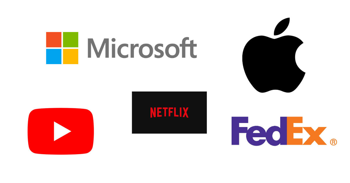
The defining trends in minimalist logo design, of course, are the absence of unnecessary detail. Features like clean lines, flat shapes, and uncluttered compositions keep logos legible at any size, from mobile screens to large-format signage. By focusing on simplicity, brands create logos that are easy to spot. Apple has championed this approach: its minimalist identity, which shows only an apple icon, has remained memorable across decades, helping it stand out clearly and command a strong market position.

Typography‑Led Logos
Minimalist wordmarks and lettermarks are gaining popularity, with brands choosing refined typography over complex symbols. Typography-led logos also support consistency across digital and physical brand touchpoints. For instance, the sans‑serif fonts, custom lettering, and subtle typographic tweaks help convey personality while maintaining a modern, elegant look.


Limited Colour Palettes
Another key trend is the use of restricted colour palettes. Many minimalist logos rely on a single colour or monochrome schemes. Neutral tones such as black, white, red, and grey remain popular, while carefully chosen accent colours are used sparingly to create distinction without visual noise.
Take, for example, the Netflix logo: the bold red “N” set against a black background. It is simple yet striking, proving that a limited colour palette can deliver high impact, instant recognition, and a strong emotional presence without unnecessary complexity.

Geometry and Balance
Minimalist logos increasingly favour geometric forms and balanced proportions. Circles, lines, and simple shapes convey precision, stability, and professionalism. This approach allows logos to feel structured yet approachable, making them suitable for global and cross-industry branding.

Digital‑First Design
With digital platforms now the primary brand touchpoint, minimalist logos are designed to perform seamlessly across screens. Responsive logo systems, in which simplified versions of the logo are used for icons, apps, and social media, are becoming the standard. Minimalist design ensures usability without sacrificing brand identity.
Timeless Over Trend‑Driven
Minimalist logo design marks a shift away from short‑lived design trends and toward lasting relevance. Rather than following what’s trendy in the moment, brands are choosing identities that can endure over time, reducing the need for constant reinvention while maintaining a consistent presence.
A thoughtfully crafted minimalist identity feels evergreen without being tied to a specific era, helping to protect long‑term brand equity. Amazon’s logo evolution is a clear example: subtle refinements over the years have kept the brand contemporary while preserving its core visual story, proving that simplicity can endure as a brand grows and diversifies.

Authentic Brand Expression
Minimalist logo design isn’t about stripping everything back until brands look the same; it’s about being intentional. The strongest branding identities communicate exactly who a brand is by using only what truly matters. When done well, this approach feels honest and confident, helping brands build trust and stand out in an overcrowded visual landscape. The clarity of intent is what makes minimalist branding feel authentic, memorable, and enduring.