A professional looking website is not just about having the right words, the right pages, or the right platform. Visitors judge your business by what they see first: the layout, fonts, spacing, colors, images, buttons, and the way everything lines up. They may not know the design terms, but they can feel when a website looks clean, credible, and easy to trust.
In this article, you’ll learn how to spot the visual details that make a site look professional. We’ll look at typography, layout, open space, visual hierarchy, alignment, color, image quality, mobile design, and consistency. The goal is simple: help you see the design problems that many new business owners miss.

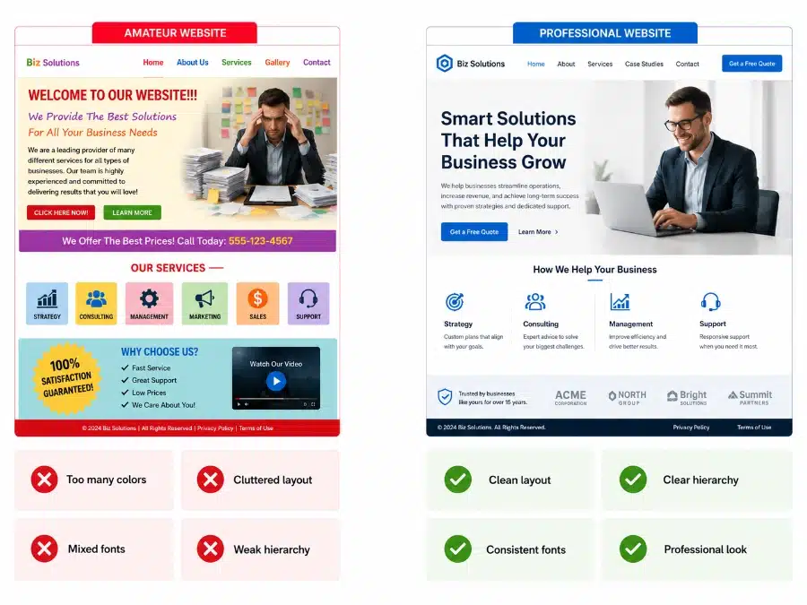
1. Your Website Gets Judged Fast
Most visitors decide how they feel about your business before they read much. They look at the top of the page, the spacing, the headline, the colors, and the overall order. If the page feels messy, dated, or hard to scan, trust drops before your offer gets a fair chance.
This is why visual design matters so much for a new business. You may have a great product, smart pricing, and a clear offer, but a weak first impression can make people pause. If you’re still building your foundation, pair this article with what you need to know to create an effective website.
For beginners, the key question is not “Is this beautiful?” The better question is: “Does this page feel clear, current, and easy to trust?”
- Good visual sign: the page feels calm and easy to scan.
- Bad visual sign: everything competes for attention.
- Quick fix: simplify the top section before changing the whole site.


2. Typography Sets the Tone
Typography is one of the fastest ways to make a website look professional or amateur. A weak font setup can make a real business look homemade. A clean font system can make the same content feel calm, organized, and credible.
Most business websites should use one font family, or two at most. Body text should usually sit around 16 to 18 pixels, with enough space between lines. Headings should be easy to spot, and buttons should use clear, readable text.
Common font mistakes include tiny text, thin gray letters, script fonts for serious messages, all-caps paragraphs, and too many font styles on one page. Good typography gives the reader a path. It shows what to read first, what supports the point, and what to click next.
- Use one main font family for most of the site.
- Use bold for headings and regular weight for body copy.
- Avoid long centered paragraphs because they are harder to read.
- Check mobile line breaks so headlines do not wrap awkwardly.
3. Layout Creates Order
Layout is the way your page is arranged. It decides where the headline goes, where the image sits, where the button appears, and how sections stack down the page. Good layout makes the page feel easy before the visitor reads the details.
A common beginner mistake is trying to fit too much into one screen. The top section may include a headline, logo, menu, paragraph, two buttons, badges, icons, and a large image all competing at once. That creates noise.
A better layout gives each element a job. The headline explains the offer. The subtext supports it. The image adds context. The button gives the next step. If you’re planning your first site, this connects well with building your first business website for total beginners.
- Good layout: each section has one main point.
- Weak layout: the visitor does not know where to look first.
- Quick fix: remove anything that does not support the next action.
4. Open Space Makes the Site Feel Cleaner
Open space is the empty room around text, images, buttons, and sections. Many non-designers think empty space is wasted space. It is not. Open space helps people focus.
A crowded website can make a business feel rushed, cheap, or hard to work with. Text pushed against the edge of a box feels tense. Cards with no padding feel unfinished. Sections stacked too close together make the page harder to scan.
Open space can make a simple website feel more expensive. Add padding inside boxes. Add margin between sections. Break long paragraphs into shorter chunks. Give buttons room so they feel easy to click.
A professional looking website does not need more decoration. It needs order, readable text, clean spacing, and a clear next step.
- Add space above and below headings.
- Give cards padding inside the border.
- Keep paragraphs short enough to scan.
- Use fewer elements per section.
5. Visual Hierarchy Tells People What Matters
Visual hierarchy means the page shows what matters first, second, and third. Visitors should not have to figure that out on their own. Size, weight, color, placement, and spacing guide the eye.
The main headline should feel like the main headline. A subheading should feel smaller. Body text should support the message. Buttons should stand out enough to be found, but they should not fight the headline.
One common mistake is making everything bold, large, bright, or boxed. When everything is loud, nothing feels clear. A professional page uses contrast with control.
- Use the largest text for the main promise.
- Use one main button style for the primary action.
- Make secondary content visually quieter.
- Check the page by squinting at it. The main point should still stand out.
6. Alignment Makes the Page Feel Planned
Alignment is one of those details people feel more than they name. When text, images, buttons, and cards line up cleanly, the site feels more stable. When edges are off by small amounts, the page can feel sloppy.
Good alignment does not mean every item must be centered. It means related items share a clear line. Headlines line up with paragraphs. Cards start at the same height. Buttons sit in predictable places.
Misalignment is easy to miss inside a page builder because you are focused on editing one block at a time. Step back and scan the whole page. Look for uneven edges, cards with different heights, and buttons that jump around from section to section.
- Use grid layouts for cards and feature sections.
- Line up left edges of headings, text, and buttons.
- Keep icons the same size inside one section.
- Match card padding across the page.
7. Color Should Feel Controlled
Color should support the message, not distract from it. A beginner site often uses too many colors because each section was built at a different time. One button is blue, another is red, links are green, icons are orange, and backgrounds change for no clear reason.
A professional looking website usually has a simple color system. Use one main brand color, one accent color if needed, and neutral colors such as white, off-white, charcoal, and light gray. This keeps the page calm.
Color choice should fit the business. A law firm, bookkeeper, or consultant may need a quiet and stable palette. A children’s product or creative brand can use more energy, but it still needs control. For a deeper look at this topic, read choosing industry appropriate colors for your brand.
- Use one color for primary buttons.
- Use dark text on light backgrounds for readability.
- Do not make every section a new color.
- Check contrast so text is easy to read.
8. Images Can Build or Break Trust
Images carry a lot of weight. A blurry, stretched, or generic photo can make the whole site feel less credible. A sharp, well-cropped image can make a small business look more established.
Image style should match the business and audience. A local service business may need real photos of the owner, team, work truck, office, or completed projects. A software company may need clean interface screenshots. An online store needs product photos with steady lighting and consistent crops.
Do not use images just to fill space. Each image should help the visitor trust the business, understand the offer, or feel the result. If photos are a weak spot on your site, review the importance of good photography for your website and business success.
- Use sharp images that are sized correctly.
- Avoid stretched photos because they look cheap fast.
- Use similar image crops across cards and galleries.
- Show real proof when possible: work, people, products, results.
9. Consistency Makes the Brand Feel Real
Consistency means your site uses the same visual rules across every page. The same button style. The same heading sizes. The same font system. The same spacing pattern. The same link style.
Inconsistent design often happens when a business owner adds pages over time. One page came from a template. Another page was copied from a landing page builder. A third page was created by a different freelancer. The visitor may not know why it feels off, but they notice.
Create a small visual rule sheet for your site. Write down your heading sizes, body font, button color, button shape, section spacing, image crop style, and icon style. If you are building a larger brand, this pairs well with ways to create a powerful brand for small business owners.
- Make buttons look the same across the site.
- Repeat section patterns so pages feel connected.
- Use one icon style in each section.
- Do a page-by-page visual check before launch.
10. Mobile Design Is Often the First Impression
Many visitors will see your site on a phone before they ever see it on a laptop. That means mobile design cannot be treated like a smaller copy of the desktop design. It needs its own visual check.
Mobile problems are easy to spot once you know what to look for. Long headlines may break into strange lines. Buttons may be too small to tap. Text may sit too close to the screen edge. Images may crop out the most useful part.
Check your site on a real phone. Do not rely only on the preview inside your website builder. Scroll from the top to the bottom and ask: Can I read this? Can I tap this? Do I know what to do next? For more help, see 8 steps to create a responsive design for a mobile-friendly website.
- Use readable mobile text without forcing zoom.
- Keep buttons large enough for thumbs.
- Add side padding so text does not hit the screen edge.
- Check headline wraps on real phone widths.
11. Final Visual Website Checklist
You do not need to become a designer to improve the way your website looks. You need to learn how to see the common problems. Most visual issues come from the same places: weak font choices, cramped spacing, random colors, poor alignment, low-quality images, and inconsistent page patterns.
Start with your homepage. Look at the top section first. Then move through each section and ask whether the page feels clear, readable, aligned, and easy to trust. Small fixes can make a big difference.
If your website still feels off, do not start by rebuilding everything. Clean up typography, spacing, button style, image quality, and color use first. These changes often give you the biggest visual improvement with the least disruption.
Quick Visual Review
- Typography: Are fonts readable, consistent, and sized well?
- Layout: Does each section have one clear job?
- Open space: Does the page have breathing room?
- Hierarchy: Can visitors tell what matters first?
- Alignment: Do edges, cards, and buttons line up cleanly?
- Color: Is the palette simple and controlled?
- Images: Are photos sharp, useful, and properly cropped?
- Consistency: Do pages feel like they belong to the same business?
- Mobile: Is the phone version easy to read and tap?
A professional looking website is not about adding more design. It is about removing confusion. When the page is readable, aligned, consistent, and easy to scan, visitors feel more comfortable trusting the business behind it.