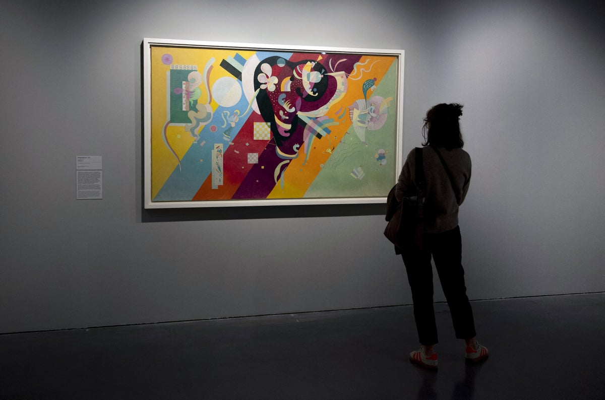
Mathematicians have calculated a “golden rule” for abstract art that famous artists tend to follow when they compose their works. Artificial intelligence, the team found, does not follow such implicit rules about shape placement, possibly explaining why computer-generated art doesn’t usually evoke awe from viewers.
Scientists and philosophers have long tried to decipher why art moves people: Are there underlying features shared among masterpieces? Do painters unconsciously use similar shapes, contours or compositions to elicit an emotional response? Many of the ways researchers have tried to categorize shapes or complexity in paintings are “arbitrary,” however, says Jacek Rogala, a neuroscientist at the University of Warsaw and co-senior author of the new study.
Rogala, co-senior author Shabnam Kadir, a mathematician at the University of Hertfordshire in England, and their colleagues looked to persistent homology, which is part of topology, a mathematical field that studies shapes as they deform and stretch. In this case, the team analyzed the contours of color in the works of Polish artist Lidia Kot. Then the researchers compared how people responded to Kot’s art and similar AI-generated art both in an art gallery and a lab.
On supporting science journalism
If you’re enjoying this article, consider supporting our award-winning journalism by subscribing. By purchasing a subscription you are helping to ensure the future of impactful stories about the discoveries and ideas shaping our world today.
The team found that viewers were drawn to certain mathematical features of abstract art and that artists created paintings with a remarkably consistent visual balance, whether they were conscious of it or not. At the same time, context matters: the way people responded to human versus AI art depended on whether they saw it on a computer screen, in the lab or in an art gallery.
First, let’s consider the math. Turning a painting into a set of data is no easy feat. Persistent homology accomplishes this by coding each layer of color to a shape. Imagine a painting of a Holstein cow: If you take everything away but the black pixels, you’ll get a few splotches of cow spots, each a unique shape. Now mark down the features of those shapes. Then add in your next-lightest color, dark gray. Your cow is now composed of some spots and a few shadows. Mark that down, too. Keep going, adding lighter and lighter shades, until your whole painting is a white cow with dark spots again.
What you’ve just built is a dataset of all the contours in the painting, or all the ways the artist positioned color in different shapes on the canvas. If you could toggle through the layers, it would morph from spots to cow and back again. And at every stage, you’ve got a snapshot of the features of these shapes, a chunk of data researchers call a “barcode.” (While an untrained human might come up with a barcode that read something like, “Um, squiggly?” mathematicians use more sophisticated numerical descriptors.)
“It is a way to talk more formally about art but without removing the soul of it,” says Barbara Guinti, a mathematician at the University at Albany, State University of New York, who was not involved in the new study.
You can do a lot of things with these barcodes. Vanessa Robins, a mathematician at the Australian National University, who wasn’t involved in the research but was one of the original developers of the method, said she and her colleagues have been using persistent homology to analyze the branching patterns in people’s lungs to see if these shapes influence survival in certain lung diseases. In Rogala and Kadir’s study, the team took the data and first decided to figure out if there were features that defined how shapes were framed in abstract art and, if so, whether they carried over from painter to painter.
“What is abstract art?” Kadir says. “Is it a bunch of nonsense that my child could create?”
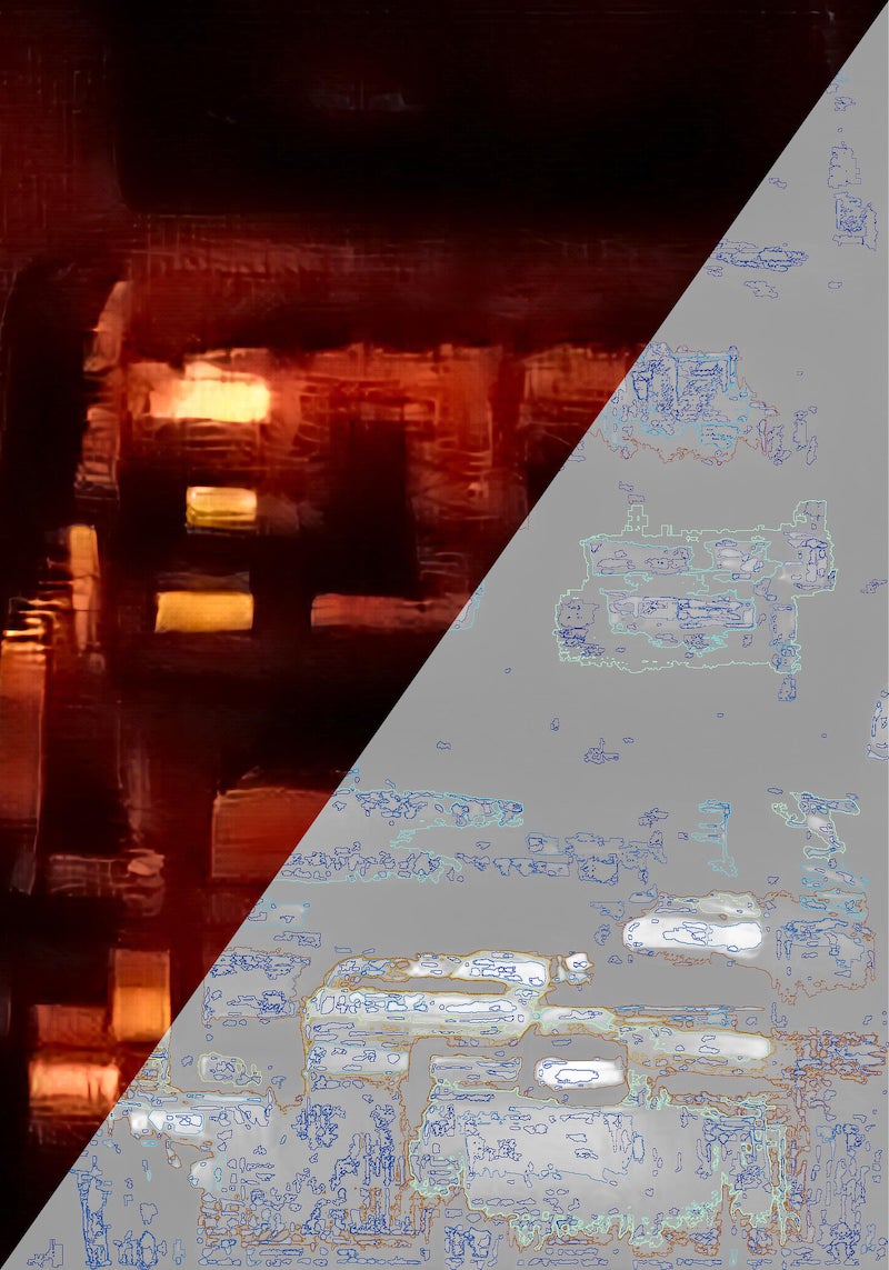
A map of shapes (right) within a complete painting (left), showing how images are made up of layers of complex shapes that can be picked out and analyzed.
Mathematically speaking, the answer is no. It turns out that Kot and famous abstract artists Mark Rothko, Wassily Kandinsky, Kazimir Malevich, Jackson Pollock and Maria Jarema all shared something in common. Do you remember our cow? If we toggle from black to white, we should get the mirror image of the bovine that we’d see if we toggled from white to black: spots to cow for the former and cow to spots for the latter. This symmetry, called Alexander duality, breaks down when shapes cross the boundaries of a painting. (Remember that our shapes get really weird in that middle bit of transitioning from spots to cow.) Bits and pieces sprawling off the edge of a canvas lead to a mathematical asymmetry. As it turned out, human abstract artists all violated this symmetry by a similar ratio (0.4, for the record, though there will not be a quiz). This discovery indicates that they had been following a certain pattern when they arranged shapes in relation with edges, Rogala says.
“It reminds us of other famous ratios in art, like the golden ratio,” Kadir says. That ratio, which works out to 1.618 to 1, tends to make objects like seashells or sunflowers look visually pleasing.
The researchers also mocked up AI “art” that matched the color intensity of Kot’s work but did so without any artistic intention. This AI art, the researchers found, did not follow the ratio for shape placement they had observed in works by human artists.
To further understand how people perceive shape features in human-made versus AI art, Kadir and her colleagues also recruited 58 participants, either college-age art students or people of similar age and socioeconomic status. Half viewed Kot’s art in the gallery and then in the lab. The other group viewed AI art, without knowing it was AI-made, in the gallery and then in a lab.
In the lab, the human art got higher ratings than the AI imagery, and people gazed at the human art for longer. In the gallery, both types of imagery got similar ratings, and people fixed their gaze at the AI imagery twice as long, the researchers reported in the journal PLOS Computational Biology. This may also be a result of topology, Rogala says. Under gallery lighting, the shapes made by color gradients may pop as people move around the art, a very different experience than viewing a static illuminated image on a screen, he adds. In other words, the fairly flat-looking AI creations may have gotten a boost from the generous lighting of a real art gallery. These findings leave a lot more to explore, Rogala says, including whether non-Western art follows these same hidden patterns of shape and form.