What if catnip were treated with the same care and cultural cues as gourmet food? Introduces Kiri. Kiri is a conceptual branding and packaging project by Estudio Albino that starts from that deliberate provocation. Rather than positioning the product within the visual tropes of the pet-supply aisle, Kiri reframes it as a lifestyle object, designed as much for the owner’s environment as for the cat’s enjoyment.
The Thoughtful Design of Kiri
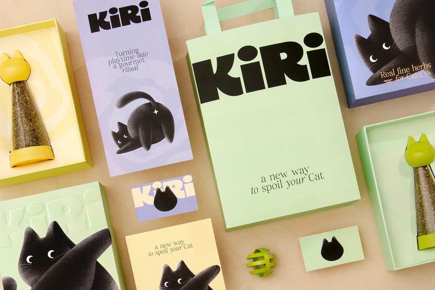
The most immediate expression of this idea is the dispensing container. Cone‑shaped, transparent, and topped with a soft pastel cap shaped with subtle cat ears, it unmistakably references kitchen tools like pepper mills or condiment servers. According to the creator, the objective was to “transform the simple act of sprinkling into a premium, aesthetic gesture,” turning use into ritual rather than routine. By borrowing from culinary design language, the container repositions catnip as something worth displaying rather than hiding away.

This emphasis on ritual is reinforced by the object’s longevity. Unlike typical pet packaging, the container is designed to be refilled and kept. That decision raises the bar for both form and materiality: the object must justify its place in the home over time. The creator describes this as part of a deeper intent to elevate an ordinary product into something people want to live with, either repurposed or refilled after its initial use.
Inside Kiri’s Catnip Packaging Concept

The outer packaging carries the framework with quiet confidence. It doesn’t try too hard, and that’s exactly the point. The box design stays consistent across all variants, creating a sense of cohesion, while subtle shifts in soft pastel tones: blue, cream, and mint. The colour selection add just enough distinction to make each one feel unique without breaking the overall harmony. A stylised black cat illustration appears on each box, while the brand name is rendered in subtle blind embossing, visible only when light catches it. This sense of restraint is deliberate—rather than clamouring for attention, the branding draws you in gently, suggesting confidence and self-assurance instead of trying to persuade too loudly.
Illustration plays a key role in the narrative. The cute black cat, with crescent‑moon eyes and a rounded, plush silhouette, serves more as an emotional cue than a mascot. Each pose suggests a different moment, and when displayed together, the packaging reads almost sequentially like a soft visual storyboard. The illustration bleeds past the box edges, lending the system a sense of openness that contrasts with rigid, highly contained pet packaging conventions.

From Catnip to Condiment
For Kiri, language completes the repositioning. The phrase “Real fine herbs for cats” borrows directly from artisanal food culture, reframing catnip as considered, curated, and giftable. As the creator explains, the tagline helps shift perception, moving catnip from a trivial accessory to a product that aligns with taste, care, and design awareness.

Kiri does not attempt to appeal to cats. Instead, it speaks clearly to their owners, particularly those who want their pet’s objects to harmonise with their home and values. By bringing together ritual, object, and language, Estudio Albino shows how considered packaging can elevate even the most ordinary product into something that feels intentional and quietly meaningful.